Thursday, December 30, 2010

look back on the year and see

Earlier this year, I decided I was going to try my hand at realistic painting.  My efforts have certainly been very educational! I learned very quickly that I wasn't very happy working in Photoshop, unlike many of my peers who seem to thrive in it.

I was very thankful for SAI and it's amazing Brush features. Even more thankful when I learned to make my own and customized it to fit my preferences for blending. The end result is much smoother pictures.

Before 2010 winds down to a close, I wanted to repaint some of my favorite pieces. It was an exercise to see how much I've improved. And an outlet to how anal I am about my work.


The first of my forays into painting. Honor is far more fleshed out in the repaint, looking less anime and just a bit more human. He's also featured with sharper cheek bones, broader shoulders and darker hair. I had to completely repaint his mouth and ears as well. What a difference eight months makes!

Van, however, was painted back in August and was already better to begin with compared to my Honor painting. But there were things that bothered me with his design so I indulged and painted him again, sharpening his features and adjusting things that were too long or were too short. Deepened his color here and there as well to really bring him out.

All in all, 2010 was a very good year for me artistically. I found new ways in which to grow and will be plugging at them some more until I've overcome more and more obstacles. :D Eventually, I will pwn the internet.

I'm kidding. Maybe.

See you in 2011!

Saturday, December 25, 2010

Jesus comics!

Merry Christmas!

I was digging through my folders and found the panels I did for my cousinbrother's project. It was a fun experience, having to work with Bible excerpts and interpreting them my own way. I left the speech balloons blank for my cousinbrother to fill in. I don't quite remember the formal titles for the panels but I hope you enjoy it anyway!


Possibly my most favorite panel ever :D It's, uh, the one where a young man is possessed by Legion.


Thursday, December 23, 2010

man and religion

For a Catholic, you'd think I'd be more religious. Religion has always been a sore spot for me, as someone who both believed in a Greater Power and who greatly disdains organized religion. I'm not big on religious activities either, despite going to church every Sunday. But I am fascinated by religion as a concept, as something people desperately cling to in adverse times.

I view religion as something that's deeply personal. You can worship whatever -whoever- gives you strength. So today I present two different concepts of religion.

There's Honor and his deep devotion to a person who gives him strength. A purpose in living, a direction in life. To pain and discipline and being alive.

And then there is Man fascinated by God, and God who is chained. Man touches Him reverently, running his hands over His face, as if that could help Man understand God better.

Tuesday, December 21, 2010

productivity, i has it

There are certain days where my creativity is drier than a desert. But there are also days when it keeps coming, so I gotta ride the train when it happens by. Last night I managed to finish two of my paintings in my folders.

The first is the Kapre I was working on the other day. I started with a dark base layer and wanted to see what I could do with it by adding lighter and darker colors. It eventually shaped up pretty well, especially when I started whipping out the details.

Painting monsters is really one of my most favorite things ever. It's ridiculously calming and I feel like it's the only thing I am actually good at.


I also decided to finish Cissa, who has also been lying around forever. I had wanted to test myself months and months ago if I could actually paint. So I started with Cissa's conceptual sketch and built on that, applying what things I picked up from watching amazing artists livestream. The top right one was my first attempt to paint, which I quickly abandoned when I realized that it wasn't shaping up how I wanted it to. Weeks later, I picked it up again, reshaping the face (and quickly learning that my strengths lay in SAI). I worked on this on and off for a couple of weeks, until I picked it up again yesterday. BAM, Cissa with shoulders! I would have gone on more but that would have exceeded my plans, not to mention gone past the PG-13 area.

Maybe I'll do that at another time!

Saturday, December 18, 2010

little myths

Did a livestream session earlier and look what I coughed up.

The Kapre is one of the Filipino creatures that appear in The Mourning Son. Since I did a little retcon of one of the major plot points of the book, I decided to play around with the Kapre. In the original myths, the Kapre is more of a trickster but in my novel something is making these poor babies go haywire. Which means, they eat humans. Not very good news, no. I'll probably futz around with this more later.

Lucifer Morningstar is probably one of my most favorite characters in the history of anything. He's charming, he's motivated, he's fed up, and he's the Devil. Also the Lightbringer. I became acquainted with the Lucifer series some time 2008 while I worked on thesis. The sketch on the top left I drew some time 2009, when I was getting a more stylistic/semi-realistic feel for my work. I also attempted to paint at that time but that wasn't very successful, no. Today, I decided to pick the piece up again and basically painted over everything. I'm a whole lot more comfortable with how it turned out.

Thursday, December 16, 2010

Process: A Wedding In Sunset

I recently completed a commission that certainly pushed me to my limits. It was a great experience, because I managed to see for myself that I really have improved and it's kind of amazing to look at all these WIP shots and go like WHOA, I DID THAT.

I'll be posting my progress throughout the project, and give you a little idea of how I do it. There's no one way to draw things, and my way certainly isn't the right way. I found that certain things worked for me, and so they're what I go with most of the time.

This picture is of Clyetes Arkanum and Nikolas Drake from CrimsonKiss89's novel in progress, Crimson Kiss.

I usually start with laying a neutral color down and using something bright and obnoxious to draw in my framework. I've got the commissioner's details sitting open on my desktop, so I can keep referring to that as I figure out what to do. It's usually at this stage I send the first sketch to the commissioner, asking if they're okay with the pose. Once I get their approval, I continue.

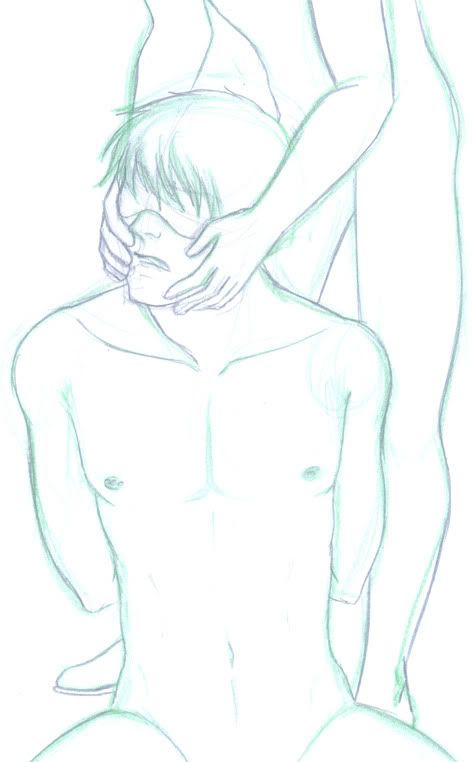
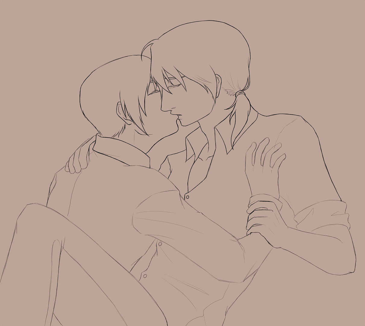
The commissioner gives me the okay and so I lower the opacity on the framework layer and create a new layer. On this one, I do the very basic sketch of the characters. Draw in their features, their clothes, and get the feeling of how the piece is supposed to go. This is one of my more complicated commissions, because it involves two people, so I send another sketch to the commissioner and ask for their approval. YES, it is a go sign! On to the next step.

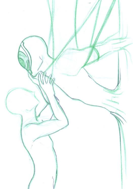
I realize that the subjects are way too far to the left and move them. This is where I make another layer (man, I have so many of them!) and start inking. I use Paint Tool SAI, and I found that the Ink Pen tool works best with my lineart. They give it a crisp and neat look. 

Inking inking inking. I've turned down my sketch layer down to maybe 5% or so.


There we go. That's the lineart right there. I take some time to make my lines heavy in some places but generally keep the lineart neat and light. As you can see, several tiny things have changed from the initial sketch.

I check my notes again and find that one of the subjects has scales along his jaw, his neck and dusting a bit of his shoulder. They're aquamarine, so I don't bother inking them in black. I use a light blue to get an idea of where they should be. 


The scene is to take place during sunset. I was a little anxious when I learned of that detail, not because I didn't want to do it but because I hadn't done it before. But hey, no harm in trying! Nothing ventured, nothing gained. If you don't like the idea of doing something out of your league (but not something you intensely dislike), don't bother opening commissions. I decide to paint the sky first, because the couple is out in the open, under the sky and the sun and their colors will be greatly affected by it. I look up several sunset photos and decide on a heavily orange, yellow and purple look. It will go great with the couple's own colors. I use a custom brush, which is textured, and layer the colors and blend until they look right.

Thus satisfied, I start filling in the couples' basic colors.


Around here, I realize I didn't like the red lipstick so I switched it out for a blue-green to match his scales.


The important thing to remember when painting is that the human skin absorbs color. Well, okay, so maybe these two aren't human, but you get the point. Skin absorbs the color of whatever's around it. In this case, our tall, dark and humongous will be absorbing purple from the sky. I shape up his features by starting with a darker brown than his base, making sure that he doesn't look flat. I then apply my purple in the places I want it. Don't worry if it looks weird; I usually take my dark brown again and blend the purple in.

Now I went and added the yellow. As you can see, they really help bring out those amazing cheek bones of his.

I flesh him out some more by adding more purple and brown. Yes, I also colored the skin under his gauzy sleeves. That skin may be mostly covered, but taking the extra effort to color it will make a far better effect. Trust  me on this one. I also started doing his hair, basically by running a dark red through it to map how his hair falls. Hair is impossible to do accurately because hair is composed of thousands of strands. I color it by clumps instead.

I now add my highlights to that hair. What is your shampoo, tall dark and humongous?


Then I do his shirt. I apply the same practice of taking purple and yellow from the background. I set down some grays for the shadows on his shirt and then blend in the two main colors. I also colored the gauzy sleeves!

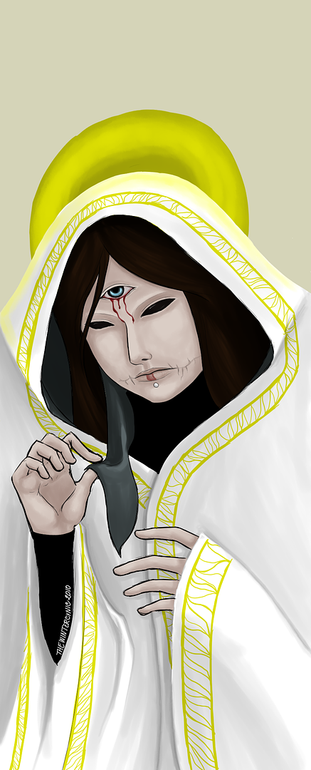
I hid Mr. Beautiful's make up because at this point, I want to start from scratch. I have to begin with the most basic thing, that would be to color Nikolas' skin. For someone with fair skin, color is absorbed more. Depending on their race, the skin tends to absorb a certain color more. In Nikolas' case, he's fair and a little pink, so he'll soak the purples right up. I get the feeling I may have been thinking of Cillian Murphy's face when I was painting Nikolas'.

With the help of a good friend, I was able to get the make up I wanted. Since I'm building on color from Nikolas' scales, I really incorporated greens and blues into his make up. Like applying real make up, I started with a green base for his eyeshadow. I then took blue and very gently blended it into the green, and as a final touch, did a bit of greyish white in just the right places. I made his lipstick extra glossy as well for extra fabulous.

There you go! I hope you enjoyed seeing my process and learned something from this huge wall of text. :D

Saturday, December 4, 2010

My half of an art trade with an amazing artist. Which one? This one. Check out their art blog.

And now for something I promised a friend on Livejournal. It's of Len from Vocaloid, multiplied into two. It's the SORAIRO! version, I believe. I'm not completely into Vocaloid but Len Kagamine is probably one of my favorites. (And I ship him madly with Kaito.) You can see the video here!